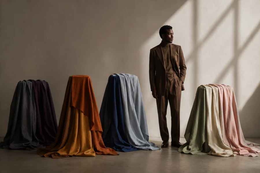
Color systems become useful when they explain relationships instead of issuing rules about personal taste. Seasonal color theory organizes shades through temperature, value, intensity, and the contrast between features. The familiar season names create memorable families, but the underlying dimensions provide the real styling value. Two people within one season may still prefer different depths, neutrals, and accent colors. Understanding that variation prevents the system from feeling like a narrow uniform. A thoughtful seasonal color palette should offer direction while leaving room for personality and context. It can identify why one blue appears lively while another feels unexpectedly heavy. The framework also helps connect clothing, makeup, metals, and accessories into a clearer visual story. Accuracy improves through comparison, repetition, and real-life wear rather than online quizzes alone. Used flexibly, the system becomes a vocabulary for choices you may already sense instinctively.
Season categories group colors that share several qualities and tend to create similar visual effects. Warm families contain more golden influence, while cool families lean toward blue or rosy direction. Light and dark values affect how strongly a shade competes with natural facial contrast. Clear colors reflect brightness and saturation, while muted colors carry more gray or softness. These dimensions intersect, which explains why temperature alone rarely solves every question. A deep neutral-cool person may prefer charcoal over icy pastels despite sharing a cool direction. Someone warm and soft may thrive in olive but feel overwhelmed by vivid orange. The season name summarizes these relationships without replacing detailed observation. Learn the dimensions first, then use category language to organize the strongest pattern. This approach makes the system easier to adapt when individual features resist a perfect box.
Temperature, value, and intensity create a three-part conversation around the face. When one quality is wrong, another strength may not fully rescue the color. A warm shade can still appear difficult if it is too bright or too pale. Likewise, a cool color may work beautifully when its depth matches natural contrast. Test one variable at a time to discover which dimension carries the greatest importance. Compare warm and cool at similar depth, then compare light and dark within one temperature. Finally, test muted and clear versions without changing the other qualities dramatically. This sequence turns a vague reaction into specific, repeatable information. Notes and photographs help reveal which dimension consistently creates the largest improvement. The result becomes more precise than selecting colors through names, trends, or personal assumptions.
A category should describe successful evidence, not force evidence to support a preferred category. Keep colors that repeatedly work, even when they sit near another seasonal family. Neighboring palettes often share useful shades, especially among neutral or flowing sub-season boundaries. Personal contrast may also change with hair color, tanning, aging, or makeup choices. Use the system to predict possibilities, then confirm them through wearing and comparison. This flexibility encourages color harmony without turning dressing into rule enforcement. Borrow strategically from nearby palettes when depth, softness, or temperature remains compatible. Avoid rejecting a beloved color before testing a better fabric or placement. A difficult shade can move away from the face through trousers, bags, shoes, or patterned accents. Theory serves style best when it expands options through understanding rather than fear.
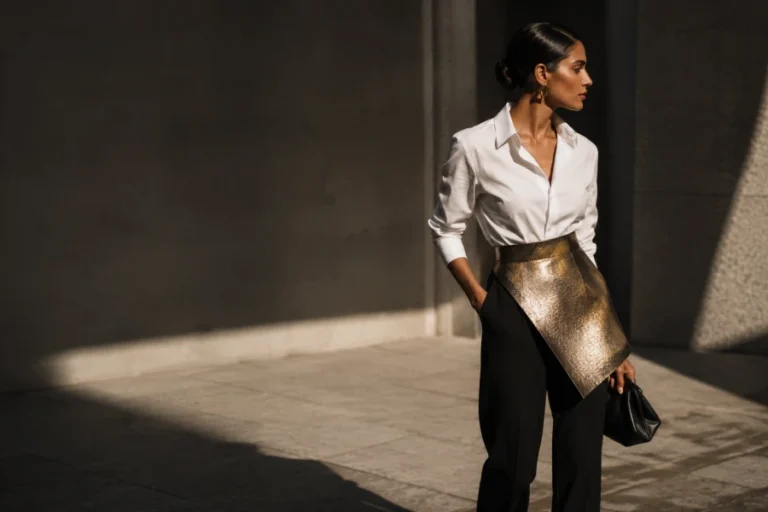
Fabric controls reflection, texture, and perceived saturation, so the same hue can produce different effects. Matte cotton absorbs light and often makes a bright color appear calmer. Satin reflects surrounding light, which can increase both clarity and contrast near the face. Sheer fabrics blend with skin or underlying layers, softening the visible color. Heavy knits create shadow that may deepen a shade beyond its flat appearance. Compare colors in materials you actually wear instead of relying only on digital swatches. Patterns can also combine a difficult color with supportive companions that change the overall balance. Scale matters because a small accent behaves differently from a full high-neck garment. Consider fabric and placement before declaring any hue permanently flattering or unflattering. Seasonal understanding becomes practical when it accounts for how clothing exists in three-dimensional life.
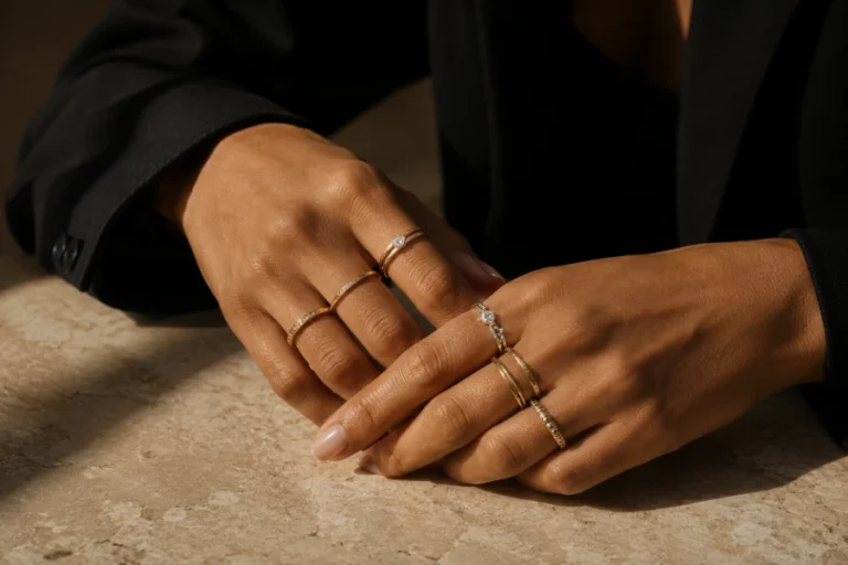
Color relationships continue through makeup, jewelry, eyewear, and even hair accessories. Lip color often reveals useful information because it sits directly beside skin and natural facial contrast. Blush can test warmth, softness, and intensity in a small controlled area. Eyeglass frames influence the entire face, making depth and undertone especially noticeable. Choosing the best jewelry metals can support harmony, although mixed metals may still work through texture and repetition. Warm gold, cool silver, rose tones, and antiqued finishes each reflect light differently. Use these elements as experiments rather than permanent verdicts. Small accessories allow low-cost testing before a larger wardrobe change. Consistency across details can create polish, while deliberate contrast can add modern tension. The system becomes richer when every element supports one intentional visual effect.
Style evolves, and color preferences often shift with environment, lifestyle, and changing self-perception. Revisit earlier conclusions when hair color changes or favorite silhouettes expose more skin near the face. Seasonal palettes should remain references, not archived identities that prevent new curiosity. Keep a core group of reliable shades while testing one neighboring direction at a time. Photograph successful experiments and note the fabric, lighting, makeup, and mood. Explore a practical method for turning color knowledge into wardrobe choices when theory feels too abstract. Real outfits provide stronger evidence than isolated swatches because proportion and styling influence the result. A flexible system grows more accurate through use. Over time, color knowledge should make dressing more expressive, not more cautious. The best palette stays recognizable while continuing to welcome discovery.


Leave a comment