
Color choices feel confusing when every mirror, trend report, and shopping page offers different advice. Color analysis for beginners creates a clearer starting point by focusing on visible relationships rather than rigid labels. The process asks how skin, eyes, hair, and fabric respond when colors change nearby. Some shades brighten the face, while others emphasize shadows or make features appear less defined. These effects become easier to notice through side-by-side comparison instead of isolated judgment. Begin with familiar clothing before purchasing special drapes or an entirely new wardrobe. Understanding warm and cool undertones helps, but temperature never tells the whole story. Lightness, depth, softness, and clarity also shape how a color behaves. The goal is not passing a test or earning a perfect seasonal category. It is developing reliable visual evidence that makes future choices calmer and more personal.
Observation works best when it begins without makeup, colored lighting, or a predetermined result. Stand near a window during consistent daylight and pull hair away from the face. Compare one fabric against another while keeping background, distance, and posture unchanged. Look for changes around the eyes, jawline, lips, and natural facial contrast. A supportive color often makes features appear more defined before the fabric itself attracts attention. A difficult color may create grayness, redness, or shadow that was less visible moments earlier. Record what happens instead of immediately deciding which season seems most appealing. This method supports personal color analysis because evidence gradually replaces wishful guessing. Repeat comparisons on another day before trusting a dramatic first impression. Consistent observations matter more than one photograph or a single opinion from someone else.
Undertone describes how warmth or coolness interacts with the complexion, but many colors sit between obvious extremes. Olive, neutral, and changing surface tones can make simple vein or jewelry tests misleading. Compare neighboring versions of the same color instead, such as coral beside raspberry. Notice whether golden cream or cool white creates greater clarity around the face. Then test depth by moving from pale to medium and from medium to dark. Intensity matters too, because muted and vivid colors can behave very differently at similar temperatures. A person may tolerate both warm and cool shades when softness remains consistent. Another may need high clarity more than a specific temperature direction. Treat each color dimension as a separate clue before combining the evidence. A nuanced result produces more useful choices than forcing every observation into one early conclusion.
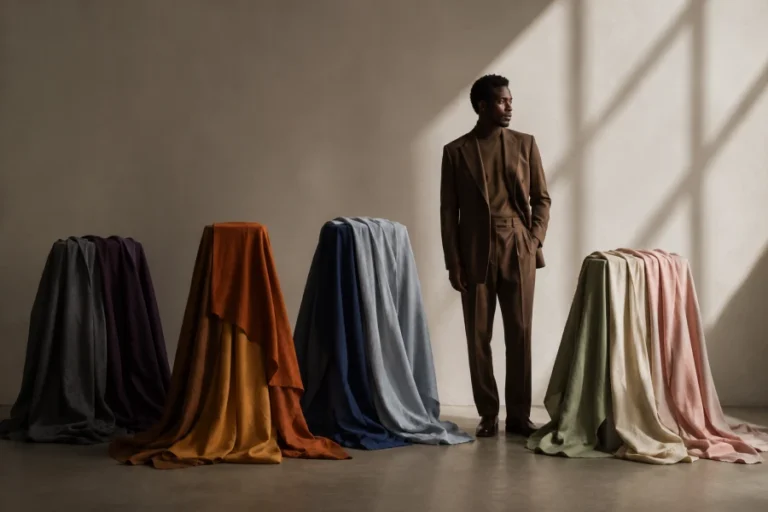
Natural light reveals color relationships more accurately than warm bulbs or bright retail displays. Choose a location without direct sun, which can create strong highlights and misleading shadows. Keep the camera exposure stable when taking comparison photographs. Hold fabric close enough to influence the face without covering the neck and jawline. Compare pairs quickly so visual memory does not fade between samples. Useful color draping at home can begin with shirts, towels, scarves, or pillowcases already available. Avoid evaluating color after staring at vivid screens, because the eyes may temporarily adapt. Step away between groups and return with a rested view. Ask which fabric supports the face, not which fabric looks prettiest by itself. Controlled conditions transform a casual experiment into evidence that can guide real wardrobe decisions.
Single colors rarely reveal enough information because the eye needs contrast to notice meaningful differences. Test neighboring shades within one family instead of comparing unrelated extremes. Place dusty rose beside clear pink, camel beside taupe, or teal beside emerald. The stronger option may reveal whether softness, temperature, or depth creates the useful effect. Repeat the comparison with several color families before identifying a pattern. Fabric texture can change reflection, so include both matte and slightly luminous surfaces. A color that works beautifully in knitwear may feel harsher in glossy satin. Keep notes about the material as well as the hue. Patterns become trustworthy when similar effects appear across different fabrics and lighting sessions. Comparison turns vague preference into a practical language for future styling.
Shopping becomes easier when color information translates into a few simple filters. Save photographs of successful shades and compare them with products under neutral light when possible. Look beyond marketing names, because identical labels can describe very different colors. Prioritize tops, scarves, and outer layers near the face when testing new discoveries. Trousers, shoes, and bags can often accommodate broader experimentation without changing facial appearance. Bring one reliable item while shopping and use it as a portable comparison reference. Check return policies before testing uncertain colors at home in consistent daylight. Avoid replacing everything at once, even after a clear breakthrough. Small changes provide enough evidence to refine the palette without creating waste. Practical analysis should improve decisions immediately while allowing understanding to deepen slowly.
Confidence grows when repeated observations produce choices that feel good beyond the mirror. Wear a promising color during ordinary days and notice compliments, energy, and personal comfort. Some shades may photograph beautifully yet feel disconnected from your personality. Others may break theoretical rules while consistently making you feel recognizable. Keep those exceptions because lived experience carries valuable information. Revisit the structure behind seasonal color relationships when patterns need clearer language. Use categories as organizing tools rather than permission systems. Personal taste, culture, mood, and context remain part of every successful color decision. Evidence should expand expression instead of narrowing it. Self-trust appears when analysis supports your choices without replacing your own response.

Leave a comment