
A wardrobe can contain beautiful clothes and still feel difficult when its colors rarely cooperate. A personal color palette creates connection by giving separate purchases a shared visual language. It does not require identical shades or a closet limited to quiet neutrals. Instead, it identifies colors that support your features, lifestyle, and preferred level of contrast. Those colors make mixing easier because more garments naturally belong beside one another. Thoughtful wardrobe color planning also exposes isolated pieces that need too many special companions. Begin with successful outfits rather than an idealized palette copied from someone else. Notice which colors make dressing faster, photographs stronger, and repeat wear more appealing. The resulting palette should describe your real habits while opening space for intentional change. Clarity grows when color becomes a system of relationships instead of a collection of separate favorites.
Wardrobe noise appears when many colors compete without enough repetition to create continuity. Every isolated shade requires specific shoes, layers, accessories, and styling decisions. Repeated colors reduce that burden because one item can support several combinations. A useful palette creates recognizable anchors while preserving enough variety for mood and season. It also helps patterns integrate, since their dominant colors can connect with existing solids. Start by grouping clothes visually and noticing which clusters already form naturally. Colors worn often deserve more influence than shades admired but rarely chosen. Remove emotional judgment and focus on evidence from actual outfits. The purpose is not creating perfect coordination across every garment. It is increasing the number of easy, satisfying combinations available on an ordinary morning.
Reliable colors are already visible in the clothes, makeup, and accessories you reach for repeatedly. Pull ten frequently worn items and arrange them in natural light. Look for shared temperature, depth, softness, or contrast before focusing on exact names. A navy, ink blue, and softened charcoal may perform one similar role. Warm cream, oatmeal, and light camel may create another useful family. Photograph combinations that feel especially balanced and compare what repeats across them. Include emotional response because a technically flattering color may still feel unlike your personality. Colors that support confidence and frequent wear belong near the center of the system. Build from evidence, then test any missing category slowly. Existing success offers a more trustworthy foundation than starting from an empty theoretical chart.
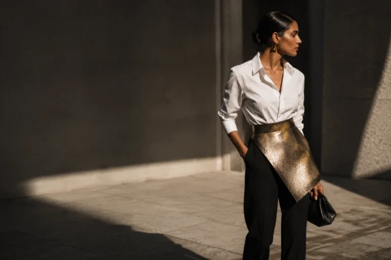
Three color roles make a palette easier to use during shopping and outfit planning. Anchors include dependable darks, lights, and medium neutrals that carry larger garments. Support colors add variety while still combining easily with most anchors. Accent colors create energy through smaller pieces, prints, beauty products, or seasonal updates. A practical system of capsule wardrobe colors may include several options within each role. The exact number matters less than whether each color has clear partners. Place any new shade into one role before buying it. If it cannot connect with at least three existing items, reconsider its usefulness. This structure prevents accents from multiplying until they create another fragmented wardrobe. Roles transform color from inspiration into a repeatable styling tool.
Testing combinations before shopping reveals whether a desired color fills a real gap or duplicates existing options. Create several outfits around the nearest shade already owned. Notice which layers, shoes, and accessories support it without special effort. Use digital collages carefully, because screens can distort undertone and saturation. Physical comparison remains more reliable when final decisions involve fabric and complexion. Borrow a scarf, try store items beside your own clothing, or compare returnable purchases at home. Photograph complete outfits from a normal distance rather than judging close-up swatches. A color may flatter the face but fail to support the wardrobe’s larger structure. Another may look modest alone while connecting exceptionally well across many pieces. Testing protects both budget and clarity by making compatibility visible before commitment.
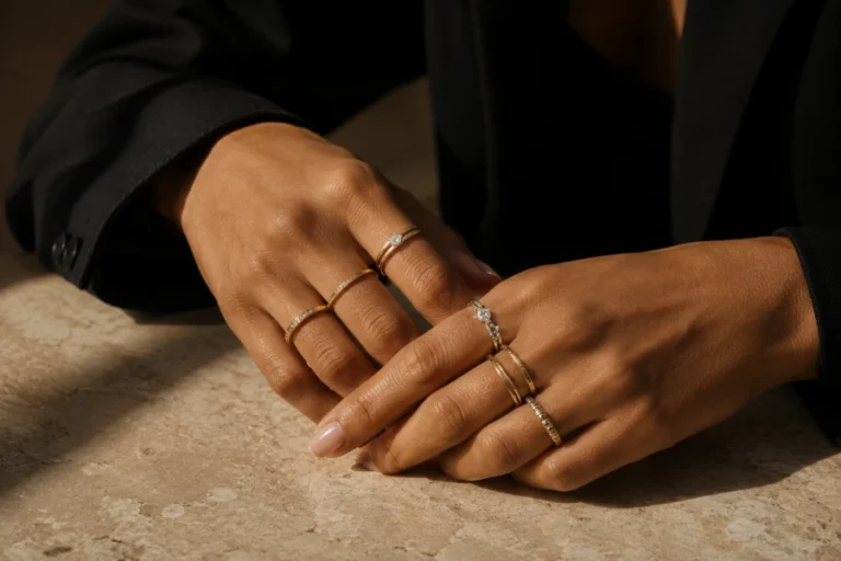
Makeup and accessories allow the palette to become more flexible without requiring major clothing purchases. Lip color can repeat an accent shade and bring distant colors into a coherent outfit. Blush, eyeshadow, and nail color can echo warmth or softness already present in clothing. Thoughtful makeup color matching does not require identical tones across every product. Related undertones and balanced intensity usually create a more natural result. Jewelry metals can act as neutrals, accents, or deliberate contrast depending on finish. Bags and shoes offer room for experimental shades because they sit farther from the face. Scarves, eyewear, and earrings influence complexion more directly and deserve careful testing. Use these smaller elements to trial colors before investing in larger garments. Accessories make the palette feel expressive rather than restrictive.
A palette should change when evidence changes, not whenever a new trend creates temporary urgency. Review it seasonally and note which colors received genuine wear. Remove shades that repeatedly require effort, even if they remain theoretically flattering. Add new colors when they connect with existing roles and support current lifestyle needs. Keep successful outliers that make you feel distinctive, because personality matters alongside harmony. Revisit the habits that strengthen confidence with color when experimentation feels uncertain. Small updates maintain continuity while preventing the system from becoming stale. Dyeing, tailoring, or changing accessories may help older garments fit the revised direction. The palette should remain a living reference shaped by use. A clear system becomes more personal as it absorbs experience over time.


Leave a comment